Overview
This project established a unified style guide for FXCM trading platforms across mobile, web, and wearable. It created a single foundation for visual and interaction design, supporting both dark and light modes from the start.
The Challenge
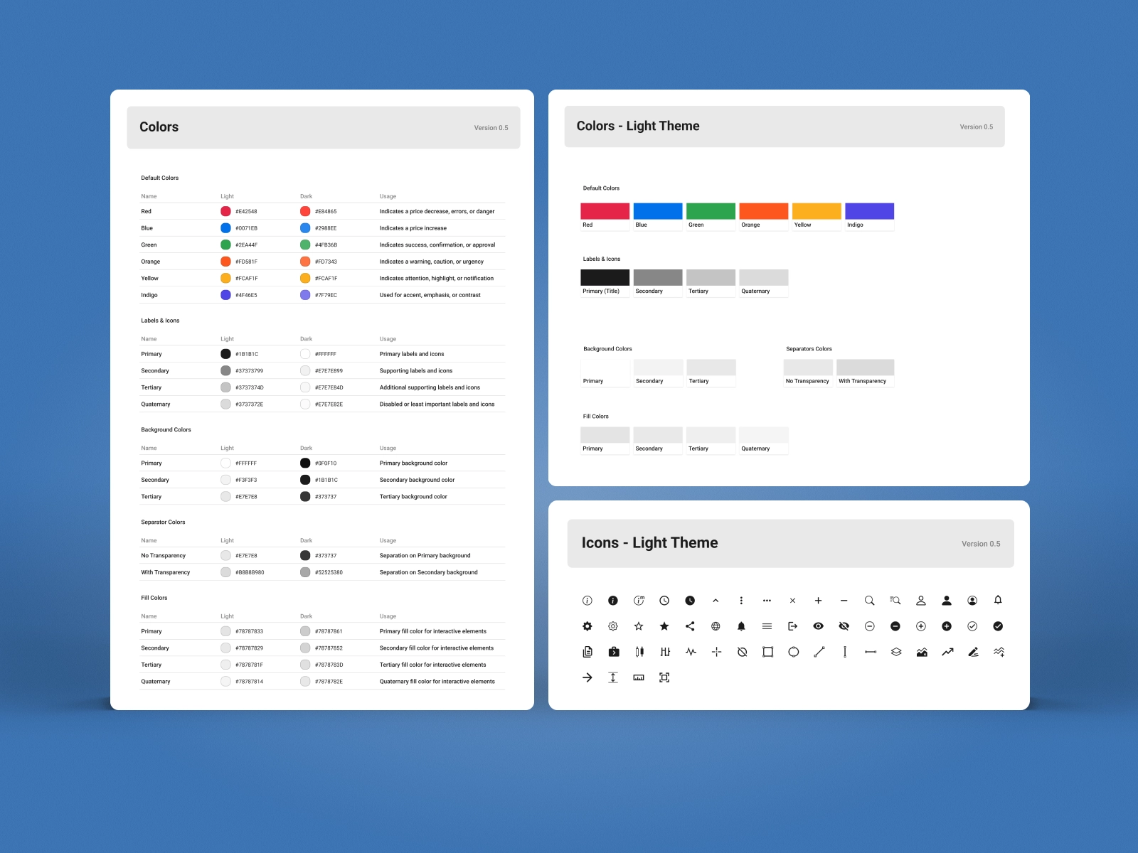
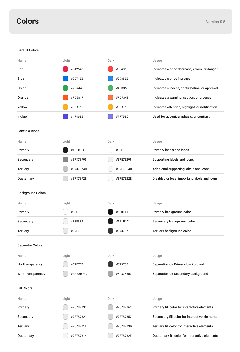
Each platform had evolved independently, with its own components and visual language. This led to inconsistency, slower development, and a fragmented experience. The system also needed to work seamlessly across themes, ensuring readability and contrast in both dark and light environments.
The Approach
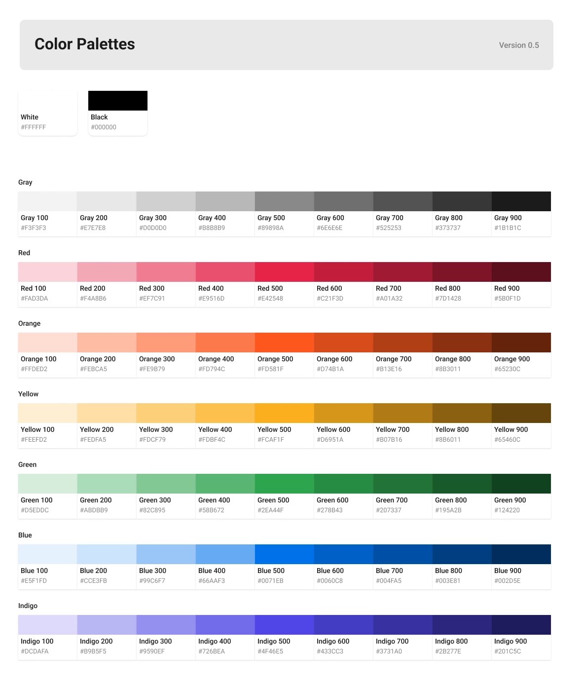
The style guide was built as a flexible system rather than a fixed set of rules. Core elements like typography, spacing, and components were defined once and adapted across platforms, while color was structured through tokens to support consistent theming.
Color palettes were designed to work across dark and light modes, maintaining clarity and contrast in different contexts. Tokens created a layer of abstraction that made updates scalable without breaking the system.
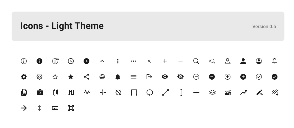
Beyond color, the system defined reusable components and a cohesive icon set. Icons were designed for clarity at different sizes, ensuring they worked equally well on mobile screens, web layouts, and smaller wearable interfaces.
The result was a shared language that allowed teams to move faster without sacrificing consistency.
Outcome
The style guide aligned all trading products under a single system, improving both design consistency and development efficiency. It made it easier to scale features across platforms and ensured a cohesive experience regardless of device or theme.
Takeaway
A strong system is not just about consistency. It is about building a foundation that adapts across platforms, scales over time, and works in every context, including dark and light modes.