Overview
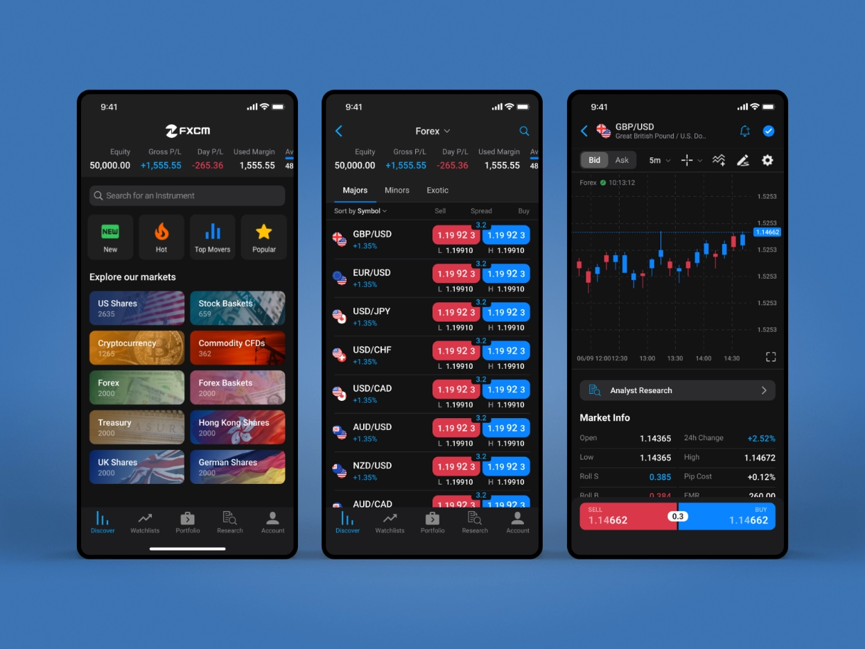
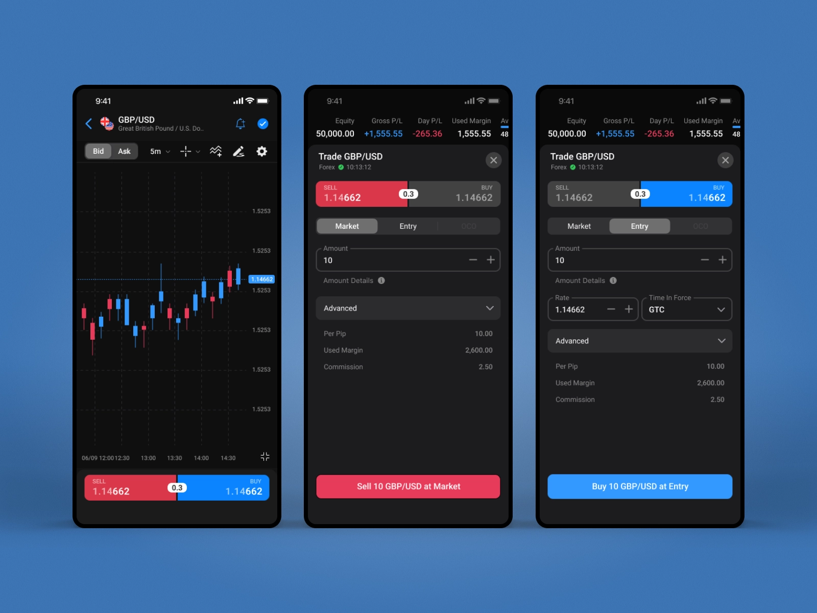
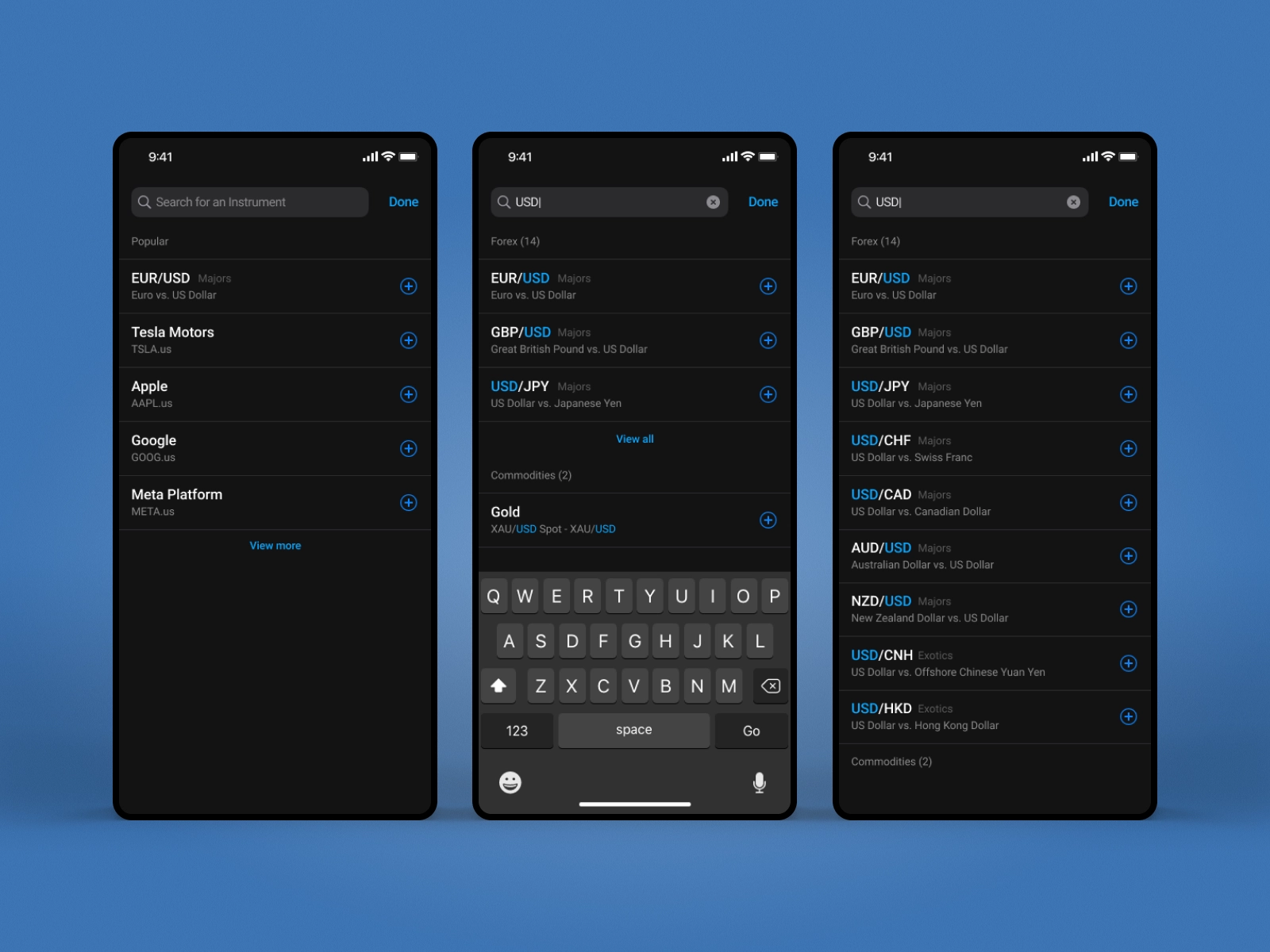
In 2022, I led a full redesign of the Trading Station mobile app. The goal was to modernize an established trading experience and bring it in line with current iOS and Android standards while improving clarity, speed, and usability.
The Challenge
The existing product had grown over time, which resulted in inconsistent patterns, dated visuals, and friction in key trading flows. While functionality was strong, the experience felt heavy and harder to navigate than it needed to be, especially on smaller screens.
The Shift
The redesign focused on bringing structure back to the experience. Instead of layering more features, the work centered on simplifying what was already there and making core trading actions faster and more intuitive.
The Approach
The visual language was rebuilt with a cleaner hierarchy and stronger emphasis on primary actions. Navigation was simplified so users could move between key areas of the app without losing context. Interaction patterns were refined to feel more native across both iOS and Android, reducing cognitive load and improving consistency.
Attention was also given to layout behavior across different devices and orientations, ensuring the experience remained stable and readable in all contexts.
Outcome
The updated app felt more modern, lighter, and easier to use. Core trading flows became more direct, navigation was clearer, and the overall experience aligned better with how users expect mobile apps to behave today.
Takeaway
Modernization in mature products is less about adding new ideas and more about removing friction that has accumulated over time.