Overview
In 2025, as a Head of UX, I led the redesign of Tradu’s onboarding experience. What was a fragmented, high-friction flow became a clear, guided journey that moves users from sign-up to first trade with confidence.
The Challenge
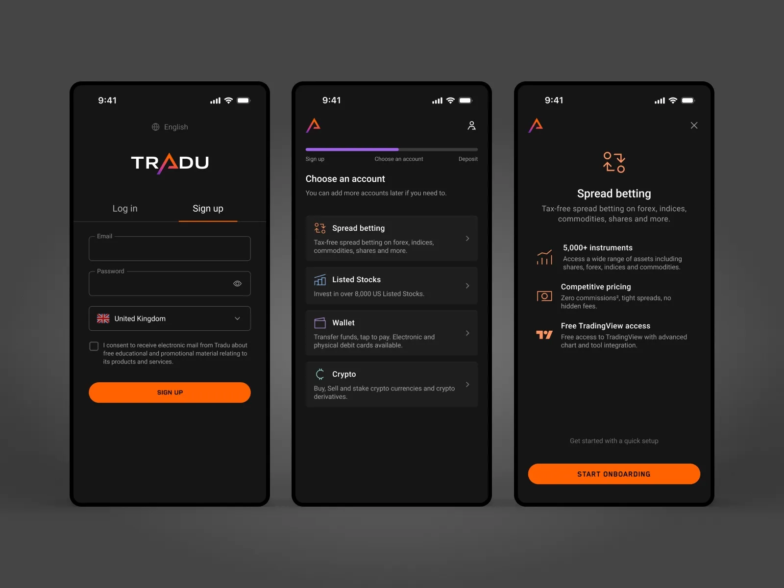
Onboarding in trading is inherently complex. Regulatory requirements, identity verification, and funding all introduce friction. In the existing experience, that complexity was amplified by disconnected steps, inconsistent patterns, and a lack of clear progress. Many users dropped off before completing setup.
The Shift
I reframed onboarding from a collection of forms into a structured journey. Each step was designed around a simple principle: give users exactly what they need to move forward, nothing more.
The Approach
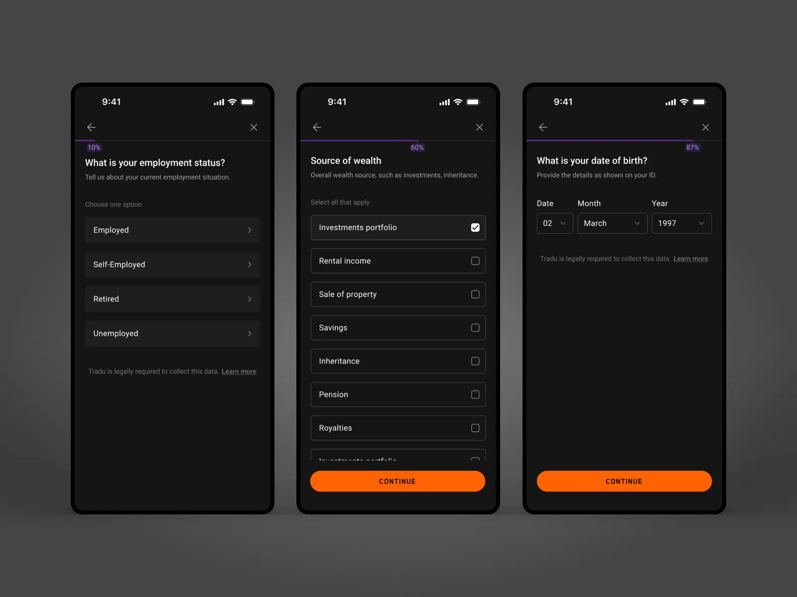
Simplifying the Flow
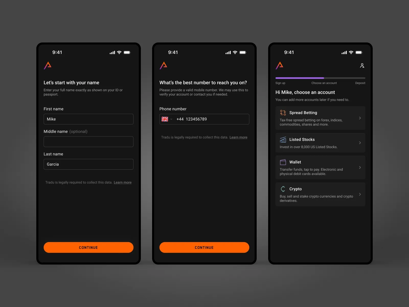
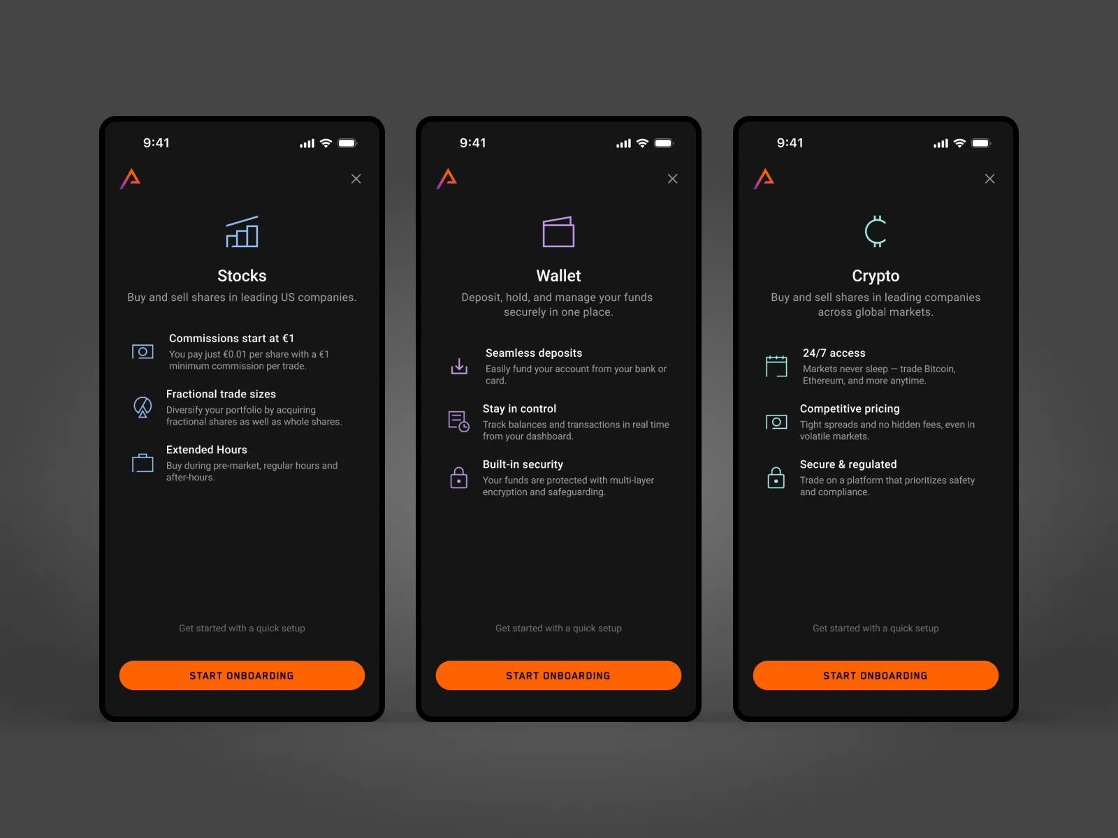
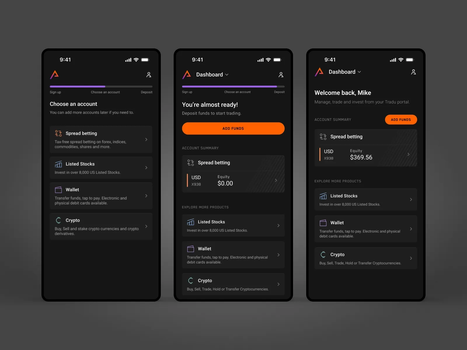
I mapped the full journey and rebuilt it into a clean, predictable sequence across account setup, verification, and funding. The result was a flow that feels intentional and easy to follow rather than fragmented.
Designing for Momentum
Progress is always visible, with clear structure and no dead ends. Users understand where they are, what’s next, and how far they are from completion, which keeps them moving forward.
Reducing Friction
Interactions were refined to remove hesitation. Validation happens in real time, inputs are simplified with smart defaults, and help appears only when needed. Errors guide users forward instead of stopping them.
System First
This was also the first full implementation of a design system I created. Components, spacing, and behavior were unified across the flow, making the experience consistent and scalable across devices and regions.
Outcome
The onboarding experience shifted from friction to flow. More users completed the process, fewer dropped off at critical steps, and time to first trade improved. It also set a clear foundation for how complex flows should work across the platform.
Takeaway
Good onboarding is not about fewer steps. It is about making each step feel obvious, necessary, and easy to complete.